|
|
| Active Players on Sylestia |
| Category |
Total |
Yesterday |
| Players |
1,481 |
286 |
| Sylestia Pet Data |
| Category |
Total |
Yesterday |
| Pets |
8,674,415 |
1,086 |
| Generated |
701,222 |
16 |
| Captured |
1,237,490 |
19 |
| Bred |
6,735,573 |
1,051 |
Statistics updated daily at midnight |
 |
|
| Author |
Thread Post |
| Faiona |
| Level 75 |
| Nature Walker |
| Site Administrator |
 |
| Joined: 12/17/2012 |
| Threads: 472 |
| Posts: 4,706 |
|
| Posted: 10/11/2015 at 2:50 AM |
Post #1 |
Taking advice from the Suggestion Forum I am going ahead and making this thread to discuss the ongoing Theme Design Contest. I will be locking all threads in General Discussion and pointing them towards this thread.
Please use this thread to discuss anything related to Fall Festival theme designing. Thank you. :) |
|
|
| SpaceElf1 |
| Level 75 |
| Ghost Writer |
 |
| Joined: 9/17/2014 |
| Threads: 711 |
| Posts: 13,330 |
|
| Posted: 10/11/2015 at 2:56 AM |
Post #2 |
Cool! I'm first! This never happens!
The "Apples and Pears Bulbori"--
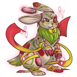 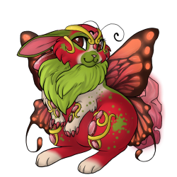
Since I don't collect Bulbories, I would really like to know what Bulbori fans think of this color combo. |
|
| Edited By SpaceElf1 on 10/11/2015 at 3:51 AM. |
|
|
|
| Amarok |
| Level 75 |
| Terrifyingly Thrifty |
 |
| Joined: 4/17/2015 |
| Threads: 105 |
| Posts: 2,892 |
|
| Posted: 10/11/2015 at 3:13 AM |
Post #3 |
|
|
|
| SpaceElf1 |
| Level 75 |
| Ghost Writer |
 |
| Joined: 9/17/2014 |
| Threads: 711 |
| Posts: 13,330 |
|
| Posted: 10/11/2015 at 3:47 AM |
Post #4 |
Amarok, a kind person pointed out that I should only have posted pet Themes in this thread, so I changed my post above yours, taking away the Mutation and the Avatar stuff. But I thank you for the complement! I think the Mutation would look better, of course, if redrawn by a professional artist.
And if anybody else would like to see what Amarok is talking about, my "One Hundred Tails" Zolnixi Mutation is here--
https://www.sylestia.com/forums/?thread=29683&page=6#53 |
|
|
| Chocolat |
| Level 70 |
| The Sweet Tooth |
 |
| Joined: 2/10/2015 |
| Threads: 66 |
| Posts: 1,178 |
|
| Posted: 10/11/2015 at 4:07 AM |
Post #5 |
|
|
|
|
| Posted: 10/11/2015 at 6:37 AM |
Post #6 |
I couldn't actually think of good theme names for this one, so I just stuck a random name on it. Any help?
 |
|
|
| Aquari |
| Level 70 |
| The Majestic |
 |
| Joined: 4/17/2014 |
| Threads: 79 |
| Posts: 1,923 |
|
| Posted: 10/11/2015 at 8:05 AM |
Post #7 |
Black Death Morkko |
|
|
| Esylana |
| Level 70 |
| Enchanted Explorer |
 |
| Joined: 7/19/2013 |
| Threads: 10 |
| Posts: 275 |
|
| Posted: 10/11/2015 at 8:06 AM |
Post #8 |
I would love feedback, personally. I feel like all of my designs are a little 'dull' in comparison to some others that have been posted. XD :P
The majority of my designs can be found here. Post #9. |
|
|
| Esylana |
| Level 70 |
| Enchanted Explorer |
 |
| Joined: 7/19/2013 |
| Threads: 10 |
| Posts: 275 |
|
| Posted: 10/11/2015 at 8:08 AM |
Post #9 |
I love Aquari's suggestiong of 'Black Death Morkko'.
Along the same lines, I also suggest 'Creeping Death Morkko'. :) |
|
|
| Esylana |
| Level 70 |
| Enchanted Explorer |
 |
| Joined: 7/19/2013 |
| Threads: 10 |
| Posts: 275 |
|
| Posted: 10/11/2015 at 8:30 AM |
Post #10 |
Your designs are beautiful, but I have three that really stand out and are my favorites, I think.
First, that Sweater Weather Luffox! The name is adorable and fits it perfectly, the grey reminds me of some sweaters I have in my closet, and the blue and the brown remind me of frost on the ground, which is perfect for sweaters. I probably would hunt/catch that themed in bulk if I could manage it. :P :)
~~~
Secondly, the Sugarskull Zolnixi. The colors are playful, and the theme feels really unique. The rainbow genes look gorgeous on this design, which can be hard to pull off! I don't know for sure if you were aiming for a Day of The Dead feel, but I really like where this is going - my only concern is the color used for color 3.
I went into the generator and played around with the design a little, in terms of trying various gene/mutation combinations, and there is one thing I always try to keep an eye out for, both in my personal designs and in other designs - the ability to discern and see all three genes clearly.
Using the same color for color 3 for gene 3 makes it harder to see certain gene 3's when gene 1 is also showing, because some of the gene 1 colors use color 3 as the secondary accent palette. A suggestion is to change color 3 (not gene 3 on the Nixi, because that edits the swirly lines around the ears and tail. :) ), to bring out gene 3 better. One of my favorite genes is Leaf, because of the way it shifts colors halfway through the design, but when the colors are the same throughout, it makes it harder to see.
Otherwise, I love this Zolnixi design!
~~~
Third, the Blood Moon Draeyl. I'm not a big fan of Draeyl, personally, but I love the interplay between the cream and the red on the black. It's another design I would be proud to add as a project to my stable, and it fits its name really well. |
|
|
|
|
|