|
|
| Active Players on Sylestia |
| Category |
Total |
Yesterday |
| Players |
1,485 |
299 |
| Sylestia Pet Data |
| Category |
Total |
Yesterday |
| Pets |
8,676,850 |
1,069 |
| Generated |
701,298 |
36 |
| Captured |
1,237,575 |
31 |
| Bred |
6,737,847 |
1,002 |
Statistics updated daily at midnight |
 |
|
| Author |
Thread Post |
| Celticnuru |
| Level 70 |
| The Kind-Hearted |
 |
| Joined: 12/17/2017 |
| Threads: 244 |
| Posts: 4,998 |
|
| Posted: 10/6/2019 at 11:32 PM |
Post #1011 |
That should work. Mainly you are trying to convey the areas specifically that you think could use the change. So it if is wings, I would think that would be acceptable. |
|
| Edited By Celticnuru on 10/10/2019 at 11:54 AM. |
|
|
|
| Limor |
| Level 72 |
| The Kind-Hearted |
 |
| Joined: 7/5/2016 |
| Threads: 293 |
| Posts: 19,132 |
|
| Posted: 10/7/2019 at 11:11 AM |
Post #1012 |
Foreboding Gene

Redone

Hell's Arcane

Critique
So with your design the colors on the whole thing seems very muted, with too many browns. The blue on the shirt also seems out of place, it is very pastel compared to the rest of the design that is mainly monotone with earthy reds and browns. The wings also seem slightly out of place, as they distract from the background animal. The head could also be perhaps changed, maybe try the Ghostly Tiara, on page 29. For the shirt hex code try maybe a c5d6d9 which just gives it a more muted gray tone. I really enjoyed the expression on your character, it conveyed emotion well. The story you told with it also enhanced your design and gave it a good in depth touch. |
|
| Edited By Limor on 10/9/2019 at 2:19 PM. |
|
|
|
| Sairento |
| Level 75 |
| High Priest |
 |
| Joined: 8/24/2018 |
| Threads: 164 |
| Posts: 7,943 |
|
| Posted: 10/7/2019 at 3:29 PM |
Post #1013 |

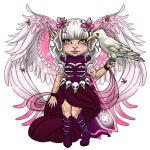
'Oh, Timey, Wispy be patient! You can have the guts and the soul after I take the bones~! After all, I was the one who finished him off~'
~~~~~

Thank you for your critique! I've made 'Wispy' a darker red. I've also removed some black from the outfit, I kinda want the wings and hair to stay black.
~~~~~
Critique
This is an awesome avatar design, very spooky. It was kind of hard trying to find something to improve or change in the design, but here are my thoughts anyways. I think the the bottom half bit of the body is a bit too colourful compared to the top, maybe add some black to the bottom half, or add some colour to the top? I personally think it would look better without the green, but, your choice. But other than this, awesome avatar design.
Edit: Also pretty sure you should change you image size. |
|
| Edited By Sairento on 10/8/2019 at 12:28 AM. |
|
|
|
| Shimeree |
| Level 70 |
| Fancy Pants |
 |
| Joined: 2/23/2017 |
| Threads: 6 |
| Posts: 261 |
|
| Posted: 10/7/2019 at 6:02 PM |
Post #1014 |
Demonic Necromancer
 --> --> 
"Out of all the things they were expecting, the necromancer being a demon ripped straight from the pits of hell wasn't one of them."
Thank you so much for the critique!! I've brightened the red and thegold, but i did use slightly different shades to the colours you suggested to make it fit with the colour scheme just a tiny bit better.
Critique
I absolutely love your design! It's quite unsettling, and it feels like those blood red eyes are staring into my soul. In terms of changes, I think the dragon/wisp thing in the background kinda merges with the red skirt, since they're both really similar shade, so making either red darker (#520308) would help them stand out a little. Also, I feel like there's a lot of black, such as the wings, hair and outfit bottom, and it would be nice to have some variation, such as an extremely dark red (#290500) or even a really dark orange (#291200). (Numbers in brackets are possible colour suggestions)
|
|
| Edited By Shimeree on 10/8/2019 at 5:34 PM. |
|
|
|
| Shimeree |
| Level 70 |
| Fancy Pants |
 |
| Joined: 2/23/2017 |
| Threads: 6 |
| Posts: 261 |
|
| Posted: 10/7/2019 at 8:49 PM |
Post #1015 |
Sorry for the double post, but I realised I forgot to PING people with my submission (the post above). Apologies! |
|
|
| Celticnuru |
| Level 70 |
| The Kind-Hearted |
 |
| Joined: 12/17/2017 |
| Threads: 244 |
| Posts: 4,998 |
|
| Posted: 10/8/2019 at 11:02 AM |
Post #1016 |
No worries hon.
Everyone, I will be do updates tomorrow and sending out mid week reminders to those that haven't yet posted. Keep up the amazing work! |
|
| Edited By Celticnuru on 10/12/2019 at 3:16 PM. |
|
|
|
| Vanikmal |
| Level 71 |
| Trickster |
 |
| Joined: 2/11/2017 |
| Threads: 65 |
| Posts: 1,146 |
|
| Posted: 10/8/2019 at 2:35 PM |
Post #1017 |
Vampire Knight
 
Critique:
Your design is great, but I suggest making that light red/pink on the sleeves a brighter red (BD3F20) and make the bottom of the dress a brighter yellow/gold (F5D742). Other than that, It really looks good and the colors work well to make it spooky. I love how you used the large horns to aid in making the design really show the demonic aspect. |
|
| Edited By Koterfaye on 10/10/2019 at 2:40 PM. |
|
|
|
| Duckbunny427 |
| Level 69 |
| Nature Walker |
 |
| Joined: 3/12/2019 |
| Threads: 66 |
| Posts: 1,632 |
|
| Posted: 10/8/2019 at 3:59 PM |
Post #1018 |
Sorry! Gonna have to opt out of this weeks challenge. |
|
|
| Duckbunny427 |
| Level 69 |
| Nature Walker |
 |
| Joined: 3/12/2019 |
| Threads: 66 |
| Posts: 1,632 |
|
| Posted: 10/8/2019 at 3:59 PM |
Post #1019 |
Sorry! Gonna have to opt out of this weeks challenge. |
|
|
| Celticnuru |
| Level 70 |
| The Kind-Hearted |
 |
| Joined: 12/17/2017 |
| Threads: 244 |
| Posts: 4,998 |
|
| Posted: 10/9/2019 at 9:13 AM |
Post #1020 |
Hon you have a broken image in your design post. I think it was your reference picture. Otherwise, very nice job. I really like it. |
|
|
|
|
|