Forum Index > Groups, Guilds, Clubs, and Services > ~Sylestia Designers 2.0~
Page 105
1, 2, 3... 104, 105, 106... 120, 121, 122
Go to Page:
Author
Thread Post
Dragongem23
Level 63
The Tender
Joined: 7/19/2017
Threads: 254
Posts: 25,229
Posted: 11/11/2019 at 12:21 PM
Post #1041
I personally would rename the Kelpari "Fairy Lights" since that's a more common name of Dewdrop Lights.I'd also make the main color a darker one,so the rest stands out.
Like this
Something feels off with the bleak frost one,it might just be how monochromatic it seems cause everything is such a light color
As for the bulb,i love the idea,i just feel like it'd look better with a few color swaps
Vampory
Level 75
The Carver
Joined: 3/31/2017
Threads: 47
Posts: 2,992
Posted: 11/11/2019 at 1:15 PM
Post #1042
oof thanks, I like the bulb better that way too, its hard to work with a color scheme thats mostly black so xD
I suppose I can change the colors around for the kelp, maybe not that dark but.
This is what I was referencing off of so:
For the Vene I was originally thinking of like a, Silver serpant or smth? Like an underwater dragon? xD But then I realized that wasn't really chirstmas/wintery so I changed the name :p
Edited By Sl33pl3ssnights on 11/11/2019 at 1:19 PM.
Dragongem23
Level 63
The Tender
Joined: 7/19/2017
Threads: 254
Posts: 25,229
Posted: 11/11/2019 at 2:33 PM
Post #1043
Maybe try to take that blue color from the first refrence and use that as the base color for the kelp.It's a really pretty blue and should work
Limor
Level 72
The Kind-Hearted
Joined: 7/5/2016
Threads: 293
Posts: 19,132
Posted: 11/11/2019 at 2:43 PM
Post #1044
-- Sugar Cubes --
So with your qit i suggest making it 'Sugared Tea". Currently your design is a bit bland, without many colors. Also I suggest making your whites yellow based.
-- Dewdrop Lights --
With your design I would change the yellow, it doesn't fit currently. I would also add in some very dark browns to show that it was lighting up the area.
-- Aurora Borealis --
I would mainly up the saturation and remove that one green color
-- Bleak Frost --
I would add some more contrast and put in some darker greys and more vibrant blues
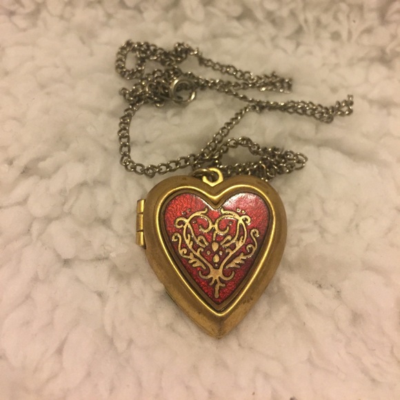
-- Heart Locket --
Seeing as how your design has your red in it I would make a design closer to this. I would make the pink a deeper red and make the yellow of the luff more gold.
-- Chimney Sweep --
I would change the browns and just tweak the colors more
Sunflora
Level 71
Ghost Writer
Joined: 6/6/2018
Threads: 10
Posts: 536
Posted: 11/11/2019 at 3:52 PM
Post #1045
I'm so sorry for posting in your storage closet, it was an accident, I forgot I had clicked the link X{
I really like your Aeridini, especially the fact that it actually looks shiny, which is pretty impressive. I'd just lighten the gray slightly on G2. But very well done!
_______________________________________________________________________
The base of your Aurleon design is a very good start! I would just draw just it just a tad more on the orange side to give it a nice, cinnamon-y base. The genes themselves need a little more variation and of a pop in color. Drawing out warmer tones such as orange and yellow will help the design feel warmer while still keeping that Christmas spice look.
_______________________________________________________________________
I love your Bulbori design! It's very aesthetic and the colors meld so well together! I played with the traits on this design for a bit in the generator and I really can't find anything to critique about it. You've done an excellent job with this design, kudos to you ^^
_______________________________________________________________________
Again, another good start. A darker base helps bring out lighter colors so the base you have is a very good start, just darken it a little more. However, looking at your design, the biggest problem that I had noticed was the burst of bright blue. It's too saturated, especially for a frost design so I'd definitely lighten that up. Good job on this ^^
_______________________________________________________________________
Your Faelora design can use a little work as it looks kind of plain and monochromatic. A strong blue base is definately recomended here. Did you know the branches of a blue spruce tree is orange? You can use that to your advantage! Adding various shades of orange along with the blue-greens create a brilliant contrast and will make your design stand out more!
_______________________________________________________________________
Unfortuneately, I do not know what your blanket looks like, but I hope it is fluffy and cozy.
Assuming the base color of your blanket is purple, the purple you have for the base of the Riki is a very nice start. I love the light purple and how well it compliments the darker color. I feel as though it needs more color variation, like different shades of purple and white, maybe add some yellow too! Just a suggestion though ^^
_______________________________________________________________________
I am not sure if the other two posts below the one I just critiqued is part of your Winter submissions (It looks to be that way but I'm not quite sure) If you would like me to continue with them, just PING me okay? Great work, your designs are improving a lot! Good luck, bud!
Vampory
Level 75
The Carver
Joined: 3/31/2017
Threads: 47
Posts: 2,992
Posted: 11/11/2019 at 4:04 PM
Post #1046
Ahhh thank you very much! I love the tweaks to the Luff, I agree that the bulb needs tweaks also. I think I may keep the Rikki the same, maybe tweaking the shades.
The qit is gorgeous, and I think I may follow that yellow-based scheme. I was originally thinking about sugar itself and how it can be sometimes blue to yellow looking, but its hard to make a design thats all light colors without it looking monochromatic. And unfortunately sweet tea seems more like a summer thing, maybe Ill go for a hot tea.'
Ive been told the Dewdrop needs a darker shade, so thats also helpful.
Wooloothedarklord
Level 63
Warden of Umbra
Joined: 2/21/2019
Threads: 114
Posts: 2,742
Posted: 11/11/2019 at 4:06 PM
Post #1047
(i know im kind of spamming you with pings but i need this to be great)
tips/critiques / feedback?
sugar plum vulnyx
evil christmas spirit
no reference pic
Sunflora
Level 71
Ghost Writer
Joined: 6/6/2018
Threads: 10
Posts: 536
Posted: 11/11/2019 at 5:36 PM
Post #1048
*pokes head through the door* Hey, I know you didn't PING me but I'm just gonna leave my two cents here. You can take it if you want it. I am mainly critiquing your Vulnyx design cause I think it would actually make a nice theme if done right so pay attention please ^^
I'm actually quite impressed with the base colors you picked, it has a very nice aesthetic to it. The gene colors, however, are way too saturated and don't quite go together.
I kept C1 and C2 the same because again, I was really impressed by this base and it can easily be worked with. I would change C3 to a royal heath color to match G1 better. Speaking of G1, to compliment the heath, I would change it to a darker pink. Don't saturate it too much though. Since the color in G2 really steals the show, I would personally change it to a plum purple so it's not overpowering the design with pink, not to mention how nicely it goes with the other colors! For G3, we are back to pink, this time a darker cranberry pink so its easier to see if we were lacking a G2 trait. Next up are the mutations, which should always compliment the genes but not be too similar in color. For M1, we are back to pink again but this time a lighter pink For M2, I'd suggest a lavender purple to draw away from the darker purples in the color palette. Lastly, for M3, a light yellow should do the trick, bringing out a pop of color, complementing the pink, and contrasting the purple. I'd recommend a similar light yellow color for the eyes too.
Griffinquill
Level 60
Ghost Writer
Joined: 9/17/2017
Threads: 124
Posts: 3,965
Posted: 11/11/2019 at 6:56 PM
Post #1049
Indeed, I love your critiques, and the other posts are all apart of that. My designs kind of came in waves. I will take many of the things you suggested into consideration. And I do not mind if you post in my closet. My very first post declares this as well.
Sunflora
Level 71
Ghost Writer
Joined: 6/6/2018
Threads: 10
Posts: 536
Posted: 11/11/2019 at 7:09 PM
Post #1050
Oh good, I was worried for a second. Anyway, I will get to the rest of your designs and soon as I can ^^
Go to Page:
1, 2, 3... 104, 105, 106... 120, 121, 122
Confirm Action
Are you sure you wish to delete this post?
Confirm Action
Are you sure you wish to restore this post?
Confirm Action
Are you sure you wish to report this post?
Go to Top
This Page loaded in 0.019 seconds.
Terms of Service | Privacy Policy | Contact Us | Credits | Job Opportunities