|
|
| Active Players on Sylestia |
| Category |
Total |
Yesterday |
| Players |
1,503 |
323 |
| Sylestia Pet Data |
| Category |
Total |
Yesterday |
| Pets |
8,667,783 |
1,013 |
| Generated |
701,015 |
35 |
| Captured |
1,237,242 |
43 |
| Bred |
6,729,396 |
935 |
Statistics updated daily at midnight |
 |
|
| Author |
Thread Post |
| Vulpie |
| Level 75 |
| Spooky Shopper |
 |
| Joined: 1/25/2014 |
| Threads: 4 |
| Posts: 482 |
|
| Posted: 8/4/2023 at 11:54 AM |
Post #11 |
Alright, so I only looked at the ones I currently have in my stables, but I did look at all of the proposed changes. At first glance, a majority of the updated ones didn't look that bad. In fact, I preferred the proposed version over the original (Blazing Fireworks, Cave Pool, Dasher, Dried Flower, Enchanted Ember, Flaming Flower, Ghostly Revenant, Gilded Wreath, Horned Caterpillar, Lucky, Moon's Kiss, Poinsettia, Poison Flower, Solar Eclipse, Vibrant Bloom, and Wilted). Upon a closer look at the ones I had, I saw some potential issues. From left to right, I have your proposed solution and then my suggested changes. Hopefully, the original creators will also add input, as I have no idea what their references were. So, I could be changing it to a completely different theme than intended.
Autumn Foliage
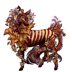 
This one may have gotten away from me, but I felt like it needed at least two other colors to brighten it up a bit. I couldn't tell you what I changed, but I did try to keep that nice dark contrast you see within the numbat of the original image. If anything, it needed more green to differentiate between the all the shades of red and purple from each other. Hopefully, others have better suggestions than what I put.
Blue Spruce
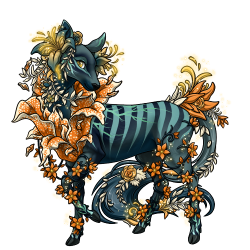 
I had fun with this one, and the colors already gave me a great place to start off. Firstly, I switched the mint green onto G1 to still keep that nice contrast in the original without being as bold as that icy blue. It's already frosted, so I tried to accentuate the beautiful blue that shows through the needles while still keeping it enchanting for winter. Because of that, I changed C5 into a more purplish-red tone to represent the branches. M1 and M3 were also given the same treatment to keep that magical look about it. Only M2 kept a darker blue tone while A2 was given a bolder mint green to differentiate between the stripes from G1 and the icy A1. I also switched the eye color with G2 to represent the sun shining down upon the tree and give more contrast between G2 and A1.
Cave Dweller
 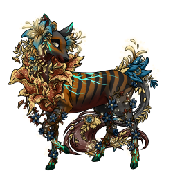
I went in the opposite direction and presented the deer as the cave itself while the genes and mutations represented parts found in or around the cave. The only parts that kept the blue-green were G2, M1-M3, and A1, as they all represented the water that can lie deep within. Whereas, the flower in G3 represented sunlight as it shines through any tiny cracks, but I'm not sure if that was what the original design was intended to be. I sadly didn't save the beautiful original before the revamp.
Forest Spirit
 
I only changed three things on this theme. I switched the suggested new eye color down to A2, as its magical tone felt more appropriate highlighting the flower rather than the eyes themselves. I also switched A2 to a more greenish color to give it a bit more coloration against G1, which can make the trait disappear at times. And because of that, I changed C4 to a darker green, so that contrast stands out better without being too forceful.
Plum Pie
 
The plum pies are getting there, but they reminded me too much of the ripe plum theme, which is already pretty purple. So, I looked at some reference pictures of the pie to help brighten them up a bit. I ended up having to switch up a bunch of slots, but for the most part, I tried to get make it look more like the baked good without sacrificing the purples already there. The pinks also gave me more of a sugarplum vibe though, so I changed them more towards magenta since plums tend to have more purples than pinks in them. I also used the flowers to represent the colors of the plum since the body was the pie itself.
Stargazer Lily
 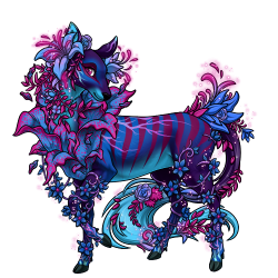
For the Stargazers, I have no idea why there was so much light blue, but it felt off in the new proposal. I loved how the contrast in the flowers looked, and I didn't want to lose that, so i switched the eyes to a more magenta-purplish color and a lighter purple in A2 to not only soften the overall look, but to stay within the blue stargazer aesthetic. The faes are not my design, but I did a small reference to what I used for my Nightgazer bulbs, which share a few colors with each other. I also changed M2 to a more purple-blue and M1 and C4 to darker blues since the pinkish-purple actually stood out too much from the quieter colors. Because the wooden branches along the legs reminded me of the filament on flowers, I changed them to match the ones on blue stargazers.
Silver Bells
 
Again, I prefer the contrast between the C4 and G1 more on the original, so I switched it back to that in my suggestion. However, I do agree that more contrast was needed between the mutations. Only problem was all the red, so I changed A2 to a darker silver. I also gave C5 a more silver-blue hue because of all the lighter colors around the body. It is a very beautiful design, and it would be a shame to lose it just from the lack of contrast between all the reds and silvers.
Sunset Poppy
 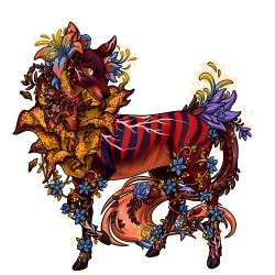
The main problem I saw was the blend in the eye and A1 slots, so I switched the eyes with the darker gold and changed A1 to more pinkish-red, that can be seen in sunsets. However, that ended up giving M1 and M2 little contrast from each other, so I darkened M1 to a dark blue to make the shine from the eyes stand out. The M2 is what I had trouble with as a dark blue worked the best, but that made it blend in with A2, where it gave better contrasts against the now brightened eyes. Overall, this one wasn't too bad, but the all of the bright colors competed too harshly against each other, so you couldn't really appreciate each trait very well.
Winter Prairie
 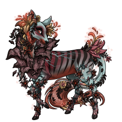
The contrast between the eyes and the flowers is lost in the proposal, so I darkened the eyes to a more reddish-orange. I did switch to a more reddish-pink in A1 though, since it looked more fitting, especially when you put on Flowered Headdress. |
|
| Edited By Vulpie on 8/4/2023 at 5:23 PM. |
|
|
|
| Reneerenee16 |
| Level 75 |
| The Kind-Hearted |
 |
| Joined: 5/29/2015 |
| Threads: 128 |
| Posts: 1,847 |
|
| Posted: 8/4/2023 at 12:11 PM |
Post #12 |
I think I personally prefer the colors of the original Blue Spruce, Frosted Pine and Cherry Cheesecake over the new proposed variants. |
|
| Edited By Reneerenee16 on 8/4/2023 at 12:45 PM. |
|
|
|
| Dreamfyre |
| Level 75 |
| Omniscient Gardener |
 |
| Joined: 2/4/2020 |
| Threads: 33 |
| Posts: 1,347 |
|
| Posted: 8/4/2023 at 3:55 PM |
Post #13 |
I like most of them, though at first glance I would say I prefer the original versions of the Mystic Spring and Somber Forest, and I would leave the eye colour green on the Aurora Borealis. May update as I look further through my stables tomorrow.
I love the changes to the M1 and G3 of the Midsummer Night, but I really don't like the change to C3.
I like the changes to Paradise Peach except for the C4. I was really hoping that would stay a light gold/yellow colour, like the eyes on the original. My favourite fae pet was a PP with leaf veins, and I really loved the colour gradient how it used to be.
  both versions look pretty much a blob of the same colour and I was really hoping for something closer to how it used to look.  Looking at the other traits affected (Jurassic, Dapple, Wild Spots, Jungle Stripes, Point Colouration and Neck Fade) I can see that the original eye colour in C4 might be a little bit too bright/far away from the rest of the colours, but I think the orange in the new design is a little too far in the other direction. Perhaps somewhere between the two?
I like everything on the new Lenten Rose except the C4, it's a bit too dark brown for my tastes, I'd make it a lighter pink/purple.
I love the new Patriotic, Blazing Fireworks and Strawberry Fields versions! |
|
| Edited By Dreamfyre on 8/7/2023 at 5:07 PM. |
|
|
|
| UntitledPrince |
| Level 75 |
| Master Sylestiologist |
 |
| Joined: 9/23/2021 |
| Threads: 160 |
| Posts: 2,219 |
|
| Posted: 8/4/2023 at 4:10 PM |
Post #14 |
Overall, these look awesome! Most of the themes are much better in the new versions, and generally I think you (and/or whoever else helped with this) did a great job! Here are just a few notes I have:
Aurora Borealis: I like the way the blues and purples change a bit to give more depth, but the classic aurora borealis green accent disappears. Could we keep the green in the new ones in place of that pale yellow?
Coral Bliss: I like original better in this case. It has blue on blue for the body, and pink on cream for the flower, which I find much more striking and high-contrast compared to mixing the pink into the blue body colours in the new variant, which just looks a bit muddy to me.
Festive: I definitely support darkening the theme the way the new one is, but there's an awful lot of blue in the new one. I'd suggest focussing more on the dark green and not making it quite so blue. In the original, there was a really minimal amount of pale icy blue as a highlight, and I preferred that.
Frosted Pine: I can't remember how the original theme looked, but that G1 grey doesn't have enough contrast against the base teal. I'd suggest a G1 colour more like #95CCB9 or something similar. But again, I don't remember what the original theme looked like before the revamp so I don't know if that's loyal to the original.
Holly Tree: I definitely support toning down the saturation a bit compared to the original, but I think the new version has gone too far the other way. Why is there so much white in it now? Where did most of the green go? And the pink?
Midsummer Nights: This used to be a predominantly pink theme with a bit of purple. Now it's become a predominantly purple theme with a bit of pink. The overall effect darkens the whole theme and gives it less contrast against the black. I'd really like to see some more of the pink brought back into it.
Mystic Spring: This is almost perfect but I think we've just lost a tiny bit too much of the signature orange accents. If you just put EC back to #FFAA00, it would be perfect!
Rotting Woods: Same as Coral Bliss, I like the first one better because the body has a couple nice contrasting colours and then the flower has a couple of its own nice contrasting colours. When they mix on the body in the new version, it isn't as nice. Though I don't think the effect is as bad on the Rotting Woods Faeloras as it is on the Coral Bliss ones.
Rowan Tree: I really like the new direction this is going in. We've lost a little bit of the green which isn't ideal but is ultimately not that bad I think. However, I think the overall effect makes the same brown on the body seem paler. I tried darkening the C1 to #382113, and I think it really makes the whole design pop, and captures how rowan trees look. It's definitely darker than the original theme was before the revamp, though, so might not be the most loyal interpretation.
Snowy Night: The new one is more loyal to how the theme used to look, but the old one looks so good, I'd actually prefer to keep the old look, or at least the C4 blue that's on the old design.
Solar Eclipse: I love how the body colours look on the new one, but I much prefer how richly orange the flower is on the old one.
Tyrielle's Minion: I think the "before" image you have there is actually the before image from the Aurora Borealis theme haha. I love how the new version looks, though! Just thought I'd point that out so you can fix the post (:
Wildebrim Hosta: I like the contrast in the new one, but I feel like the body could do with one paler colour being involved somewhere. Sort of a compromise between the old and new versions.
Again, though, awesome job overall! If none of these changes were made and it went ahead as is, I'd probably be mostly happy with that (: |
|
|
| Zekotan |
| Level 75 |
| Frosty Hands |
 |
| Joined: 12/27/2014 |
| Threads: 23 |
| Posts: 572 |
|
| Posted: 8/4/2023 at 4:33 PM |
Post #15 |
While I do like most of the new edits I'm not sure I like the C4 on the Cherry Cheesecake Fae. It feels like it's supposed to be the crust but it's just too dark for my taste. I like the paler C4 from before, but I can also see how that just hides the G3 traits, so I'm not sure what to suggest. |
|
|
| Shadowized |
| Level 75 |
| Hand of Destiny |
 |
| Joined: 10/26/2018 |
| Threads: 110 |
| Posts: 1,957 |
|
| Posted: 8/5/2023 at 8:53 AM |
Post #16 |
For the most part I love the new fae! The ones below I added a few suggestions/thoughts to.
Berry Dream: I think this one needs to be relooked at as there are some genes that dont show up very well because colors are so similar. You cant see the dapple gene all. I like the C4 being lighter, though!
Blazing Fireworks: I was debating about doing a project with these so I am a tad bit more vocal about these guys. xD I dont like the blue. It doesnt flow very well with the leaf camo, orchid, wild spots or ghost shroud. My suggestion would be to add another blue so that the a1 doesnt look so random. I gave an example.. which mind you it took me a lot of playing around to actually find something I really liked so I understand the complications lol.
 
Dried Flower: I like the original better. When flowers dry out their color fades into lighter colors and I think the new one is a bit too dark.
Emerging Myconid: The eye color doesnt really flow well with the rest of the design.
Enchanted Ember: I like the lighter c4 better (not necessarily that same color as the original.)
Festive: Not sure why but I just.. dont like the new one. Cant put my finger on the reasoning aside from maybe there is too much change to the point that it doesnt feel like the same theme if that makes sense.
Holly Tree: Like the festive fae, I feel like too much was changed here and it makes it feel like another design. A pretty design, but still too different.
Lucky: Would like to see the brownish hues to be a little more golden otherwise I love it.
Morning Glory: I love, but again too much change from the original design.
Patriotic: Maybe switch one of the blues to one of the purple blues from the original just because I'm biased towards purple xD.
Silver Bells: Love how it looks more silvery.
Silver Garden: I'm torn with this one. Some of the genes look better with the first one and some look better with the second one lol.
Stargazer Lily: Another one I'm really torn with. There are aspects of both that I like/prefer.
Sunset Poppy: I like the lighter look the first one has. I would maybe lighten the darker colors at least a little.
Wildebrim Hosta: Def like the before better. The G1 color was a particular fav part of that design. |
|
| Edited By Shadowized on 8/5/2023 at 3:40 PM. |
|
|
|
| Anemochory |
| Level 75 |
| Guardian of the Realm |
 |
| Joined: 8/29/2016 |
| Threads: 156 |
| Posts: 1,502 |
|
| Posted: 8/5/2023 at 10:59 AM |
Post #17 |
I'll mostly be commenting on my own themes for now, as I haven't looked thoroughly at the others, but I'll comment on the general impression I get from the others.
I think most of the changes for the Frosted Pine are good. The colors have mostly just been shifted around a bit. But I do think that the C2 color could be a bit darker for contrast for no-vis themes, maybe like the hex 162945?
As for the Lenten Rose theme, well...I don't like the addition of the gold colors. I see that they blend with the other colors, but it's not a part of the original theme, and the green is warmer now, too. I think I'll just submit my own suggested changes (don't know if all the traits check out; it can be tweaked if not):
Before---------------------------------------------------After
 
Doesn't look much different, but I did swap the color slots around. If anything, I'd just really like the gold color to be switched out. Maybe for a cooler yellow instead, and maybe a green closer to the original.
General impressions of the other themes:
The new Aurora Borealis is nice, but the original didn't have yellow at all, so I think the eye color should stay green.
I agree with other posters that the new Berry Dream G3 makes the flower blend in to the body too much.
The new Coral Bliss Fae looks nice. :)
Same for the Enchanted Ember.
The Festive looks very different from the original, and maybe too dark.
The new Flaming Flower looks really nice! I like this theme a lot.
Most of the suggested changes are nice, honestly.
Holly Tree did not used to have white...it doesn't look bad, but it looks like a different theme.
Hmm, Morning Glory with purple...I think it should be bluer like the original, but maybe that's just me.
I like the new Mystic Spring.
Patriotic is a big change, but I like it. It looks red, white, and blue now, instead of red, white, and purple.
Not sure about the orange color on the Rose Champagne...
I like the new Summer Salad colors better than the original.
Triggerfish looks nice.
That's all I've got from a quick look. |
|
| Edited By Anemochory on 8/5/2023 at 11:00 AM. |
|
|
|
| Agilupa |
| Level 75 |
| Monopolistic |
 |
| Joined: 11/18/2018 |
| Threads: 27 |
| Posts: 664 |
|
| Posted: 8/5/2023 at 8:12 PM |
Post #18 |
Faelora are my fav pet, so I work with the themes a lot! I have projects with several of these, so I think I'll just talk about the ones that I am doing something with.
Aurora Borealis: I hope the yellow can be switched back to the green. It was tricky to get the green onto them before the revamp, and I was super sad to lose that green when the revamp hit and changed the way diamonds looked. I think keeping the green really makes it feel like an Aurora Borealis!
Autumn Foliage: M1 might be nice as a slightly darker orange.
Berry Dream: I agree with some of the other comments that the G3 color for the new is a bit much. Either making it lighter or into something overall more vibrant might be a good idea!
Blue Spruce: I hope that the G1 on this theme can be a lighter color again. The vibrancy really reminded me of a snow covered spruce, which is why I liked it so much! I also think that perhaps the G3 and A1 for the new palatte can be swapped- I think the light blue on the orange looks more interesting than a cream on orange. It also contributes to the silvery spruce feel!
Bountiful Harvest: I like that C4 is darker! It really makes the oranges pop!
Cave Pool: I like the new C4 and C5, but I think the M1 should stay a dark blue as opposed to the orange; I feel like it looks better and makes the G1 a little less overwhelming!
Changing Seasons: I think the M1 should stay the same bright yellow, but otherwise I love it!
Cherry Cheesecake: I think C4 should be a lighter brown, since cheesecake tends to be a creamy color. I also think the eye color should go back to being on the red spectrum instead of brown.
Chilling Night: I think G3 should be a dark red, since it just feels really haunting! Pretty great revamp!
Crocus: This is definitely one of my all time favorite faelora themes; while i really like the new color allocations for the most part, I think the new C4 really washes it out. The near-white lavender looks really great, so I'd be sad to see it go. I think C4 should stay bright, maybe something like [F4E6FF]. I also am not sure about the really dark A2; I tried switching the new M3 and A2 and I liked it a lot, so that might be an option.
Dried Flower: I love it! Absolutely great job on this one!
Emerging Mycanoid: I like this other than the C4; the pink just seems a bit much, especially since that wasn't something the theme really had before. Maybe if it was much lighter? I found that looks really good with it, without being overpowering like the previous. Something like [D6B8BE] in C4 looks stunning!
Enchanted Ember: I think changing the A1 back to [ED0000] would really elevate this, but otherwise its a knockout!
Evergreen: The random yellow EC is just... a little uncomfortable? The theme didn't have any yellow, and it feels weird with it. I think switching it back to a really vibrant blue would do the trick. Something like [8FF8FF]?
Fire Eel: I think the new colors really take this one away from a fire eel... I think that G1 should stay a bright yellow, and C4 should be a dark blue. I also think G2 should stay the firey orange that it is, since that looks really awesome and like an IRL fire eel. I do think that G3 should maybe change though- as good as the orange looked with the pre-revamp faes, post-revamp the orange looks pretty bad when paired with autumn flower. I think any other future mutations that alter the flower shape might face similar problems, so that might be something worth looking at!
Frosted Pine: The warmth of the brown looks a little strange with the cools of the blues and green. Maybe a dark green instead?
Frosty Jubilations: The vibrancy of the lighter C4 looked really good, and though I also do like the new design, I personally favor the older C4.
Gilded Wreath: The grey in G1, G3, and M3 look pretty off, which might be another cool/warm colors thing. Maybe just slide the greys back into the brown ranges? I think that would be very pretty.
Holly Tree: I like that the pink is being taken out, but I'm not sure white quite fits here. Maybe a muted red or green? Also, I think someone else mentioned it, but the yellow is a little jarring- maybe a light green instead?
Horned Caterpillar: I LOVE this! This is so pretty!
Moon's Kiss: The dark nature of the C4 is a little jarring for me, but otherwise it's great!
Mystic Spring: I think this is pretty, but I feel like having the gold back on M2 would be awesome, especially since Ghostly Aura is there now! I think it would look really magical, and really live up to the name mystic spring.
Night Terror: I really like this one! the red makes it very ominous!
Paradise Peach: I think the pink on the M2 is a little overwhelming, and I think having a cream orange would make it really look like a peach! Otherwise, this is super pretty!
Peppermint Bark: The C4 on this is great! I love how it gives it more of a chocolatey feel! I think y'all did a great job on this one!
Ripe Plum: This is pretty, but I kinda wish the M2 was something different, maybe a lighter pink? The dark pink just makes it feel a little same-y?
Rotting Woods: I love the lighter brown on C4! This is stunning!
Rowan Tree: I think I prefer having a green in the M1, but otherwise it is very pretty!
Silver Bells: The new palatte works really well! I really get a sense of a 'silver bells' theme from it!
Silver Garden Spider: I think G1 and G2 should be switched back here. G1 is so much of the color in a faelora, and having the bright silver there made this theme really pretty. The brown just isn't as striking in G1.
Solar Eclipse: The brown just doesn't do it for me here. I really think this theme should stay a black base with vibrant notes of orange and gold. Putting the white in G1 makes this one, for me, look less like a solar eclipse. G1 is such a massive color element of faes, so the white is just too much, especially since it makes it look nothing like any of the other solar eclipse themes. The brown just doesn't really work either. C2 and C5 should stay dark grey, and C4 could be something like [240B06].
Summer Salad: This looks pretty cool. The only note that I'd give would be to keep the C3 and G3 the same; it just gives me more of a summer vibe.
Tyrielle's Minion: Only note I have for this is that I think you accidentally put the old Aurora Borealis in the spot for the old Tyrielle's Minion.
Vibrant Bloom: Oh yeah, that's a vibrant bloom alright! I love it!
Winter Prairie: I think the EC on this should stay the pale orangy color, but otherwise I love that it's darker and feels more like a prairie desolate with cold. |
|
|
| Ladyanki |
| Level 75 |
| Supernatural Shopaholic |
 |
| Joined: 10/26/2019 |
| Threads: 7 |
| Posts: 336 |
|
|
| Edited By Ladyanki on 8/10/2023 at 5:05 PM. |
|
|
|
| Meeku |
| Level 75 |
| Guardian of the Realm |
 |
| Joined: 7/20/2018 |
| Threads: 33 |
| Posts: 573 |
|
| Posted: 8/10/2023 at 6:57 PM |
Post #20 |
Since i have a project of the Midsummer nights faelora I was especially interested in that theme.
Theme as it is now for reference:
 
Current proposal > my edit
 
(Male)Current proposal > my edit
 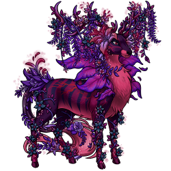
I understand there didnt used to be a C4 or C5 so those need to be filled to complement the theme.
I just thought the eye color being red and the G1 and M1 being a blackish color was really neat.
Having this theme looking more like a warm summer night with the reds and pinks appeals to me, the dark black colors being symbolic of night. Rather than having so many cool colors like purple dominating the theme. |
|
|
|
|
|