Draw the Avatar Above You! - 30/3/25
For Echosing

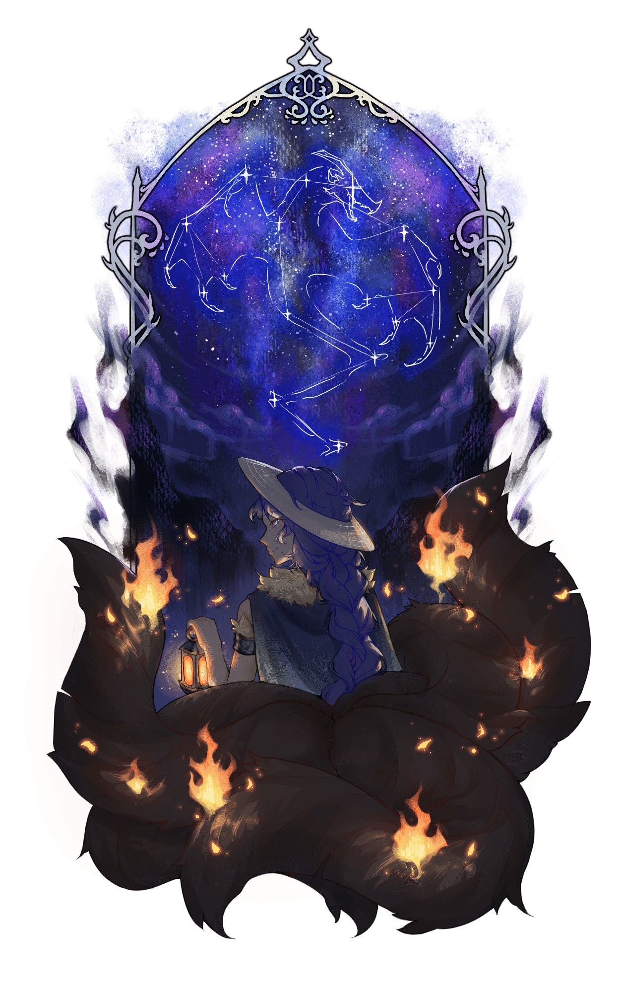
Yet another fully rendered piece! I was really inspired by the design of the avatar I drew, since it reminded me of summer nights with fireflies. That then led me to wanting to draw a night sky (I love drawing skies) so this happened.
I also made it into a gif, though as always, compression made it very crunchy:
--
Process
When conceptualising this piece, I knew it was going to be something with the night sky, with stars and a galaxy. Originally I wanted to have the character stand in a grassy field with faint mountains in the distance while the sky stretched out above them, but I couldn't figure out a good way to pose the character what with the cloak and tails.
I don't have any sketches from that idea, since I deleted it before doing the thumbnail for what would turn into the final piece, but after figuring that scene was too difficult to compose, I decided to make a vertical piece where the galaxy would seem to "bloom" from the character at the bottom. It was also during this that I came up with the idea of having the dragon in the sky as a constellation.
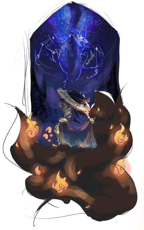
The thumbnail turned out very nice! The colouring of the tails in the thumbnail actually looks nicer than the final, since it feels like there's more light and vibrance with the larger patches of highlights but the final has a sense of mystery to it with the minimal lighting.
I had several goals going into this. First, I wanted to render somewhat more realistically than I had before (basically add more detail), and second, I wanted to include more texture in my art. A huge inspiration has been R1999's art style, which is all around amazing in all aspects from composition to execution, and from it I picked up an appreciation for the power of texture used in the right places. Pretty much all of my steps have some degree of texture added. (Texture brushes my beloved.)
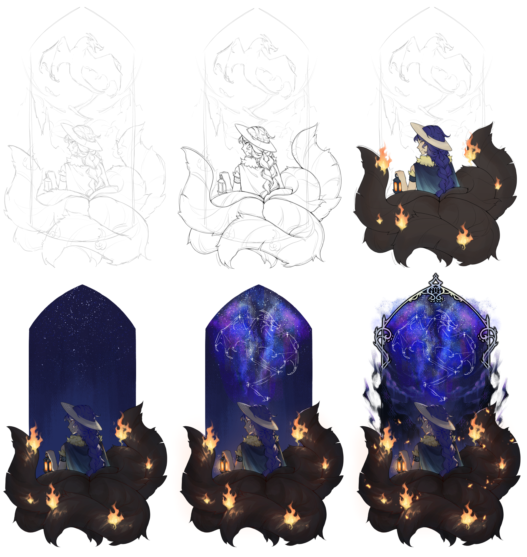
Sketching was more difficult than expected, and the thing that gave me the most trouble was honestly not what I expected. The figure was fine, since I could closely reference the thumbnail, and the change from loose hair to a braid was a challenge, but it was overall fine and fun to do. What really stumped me were the tails. Goodness knows how many times I drew and redrew and moved them around to try to make them look natural, and also to make them look balanced composition wise. In the thumbnail I just drew a bunch of curves and called it a day, but obviously there the tails are not of consistent width, do not seem to be coming from where the tails should come from, and they are heavily lopsided toward the right side of the sketch. I'm not good at drawing fur in the first place, too! Through lots of trial and error and suggestions from my wonderful friends, I was able to make it work.
Lineart was fine. I used a slightly transparent brush this time to help me with my line weight issue; I've always tended to make lineart thick and extremely flat looking. With a bit of transparency, I can create the illusion of weight by going over places multiple times to make it look darker. Of course, I also used the technique of colouring in junctions for that extra depth.
For flat colour, I've been trying a slightly different workflow. As usual, I'll colour in the different sections with flat colours, but now I've also started to add a bit of tint here and there on the flat colour layer, to help add some dimension to future rendering. I also try to "bleed" adjacent colours into each other a little to emulate a feeling of bounce light. The fire was really fun to draw - I haven't done fire in a long time.
The shading process was interesting. Usually, I make a new layer and draw the shade on. This time, however, since I had an overall dark piece where I wanted to highlight light sources, I shaded by making a new layer, clipping it to the base layers, then filling it entirely with shade. Then, using an eraser, I'd carve out where the light hits. Occasionally I'd take an even darker colour and shade in the shadows for extra details, though I forgot to do that with the hair.
... And then highlights. I didn't have to have highlights for the most part, since again, dark piece, light source emphasis, yadda yadda, so I just threw in a little glow on the edges between light and shadow, but once again the tails came to haunt me. I do not know how to draw fur. I do not know how to shade fur. I do not know how to shade fur with multiple light sources. Multiple light sources is already a big enough struggle but having to do that with fur caused me a lot of trouble. I had to redo the shading for the tails twice from scratch. In the end, it kind of? worked out?
Finally, the last renders and all of the background. Boy do I love drawing the sky! The night sky in particular, with stars and clouds and galaxies. I really got to play around with composition and texture here, which made me very happy. I initially didn't plan on adding a frame, but upon finishing most of the piece (including the bits where the image "escapes" from within the frame) it looked somewhat bare, so I slapped that around everything and it came out great.
Very proud of this one :>
(No more process gifs in the foreseeable future because Krita sucks for making those)
Animation was very difficult. Krita is not the greatest software for animation. If there's anything I miss about Photoshop, it was the animation workspace, and the ability to work with After Effects, which has a really nice feature that allows you to define "bones" in your piece and animate using warp meshes based on those bones. I just stuck with transform masks and tweening, and to be honest, doesn't look half bad. Krita did crash halfway through, though. Thankfully a few minutes beforehand I'd remembered to save so not much was lost.
|