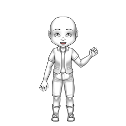
Hello, sylestians! I've noticed so many posts that are hard to read or contain major problems, so I made a guide on accessibility.
Making your posts accessible for blind people
Although most blind people have some level of vision left, a lot of them use a screen reader to work faster or because it makes it easier.
A screen reader is a special tool for blind people that reads out text on the screen for them.
But how can they see images, you ask? Image descriptions or image alts, descriptions of the image that are read out by the screen reader.
An image alt is a basic accessibility feature in HTML. An image alt can be added by putting alt="a description of the image" after the src/image url.
Example, remove the *s:
<*img src="img url here"
alt="picture of a cinnamon skinned sylestia avatar with red and blue clothing"*>
If an image alt can't be used due to BBCode instead of html, etc, We can use image descriptions. An image description is text that describes what an image looks like, mainly used for screen readers.
It comes after the image, and is mainly put in brackets or parenthesis with id at the start and end id at the end. A description is put in the area between id and end id. example:

(id: picture of a cinnamon skinned sylestia avatar with red and blue clothing. end id)
Things to avoid in image descriptions and alts:
* Overly complicated descriptions like "Lined picture of a cinnamon skinned sylestia avatar, with short hair in a bun, a flower in the hair which is in red and blue colors, a sweater with red colors, and jeans with blue colors, and sandals".
* If a paragraph is long, a screen reader will ask if they want to continue in the middle of the paragraph. Chances are that they'll skip your description.
* Not mentioning the skin tone or the race if its a humanoid. It implies that whiteness is the norm. Race is important! Example of what not to do: "Picture of a sylestia avatar with red and blue clothing"
* All caps. Do not put it in all caps, otherwise you're going to have a screen reader yell at a blind person. For the sake of blind people, I'm not going to provide an example.
Making your posts accessible for dyslexic people
* Use bold, not italics, to highlight ideas.
* Use lists for steps.
* No long paragraphs with no line breaks. It causes confusion for them.
* For the love of g-d, don't put white text on whiteish areas. It strains people's (blind, dyslexic, or not) eyes and makes it hard to read. Put a dark color on white areas instead. Example of what not to do: Can you read this white text?
Closing statement
Thank you for reading. I'm an advocate for accessibility, and I'd thought I could make a guide to help people. |


